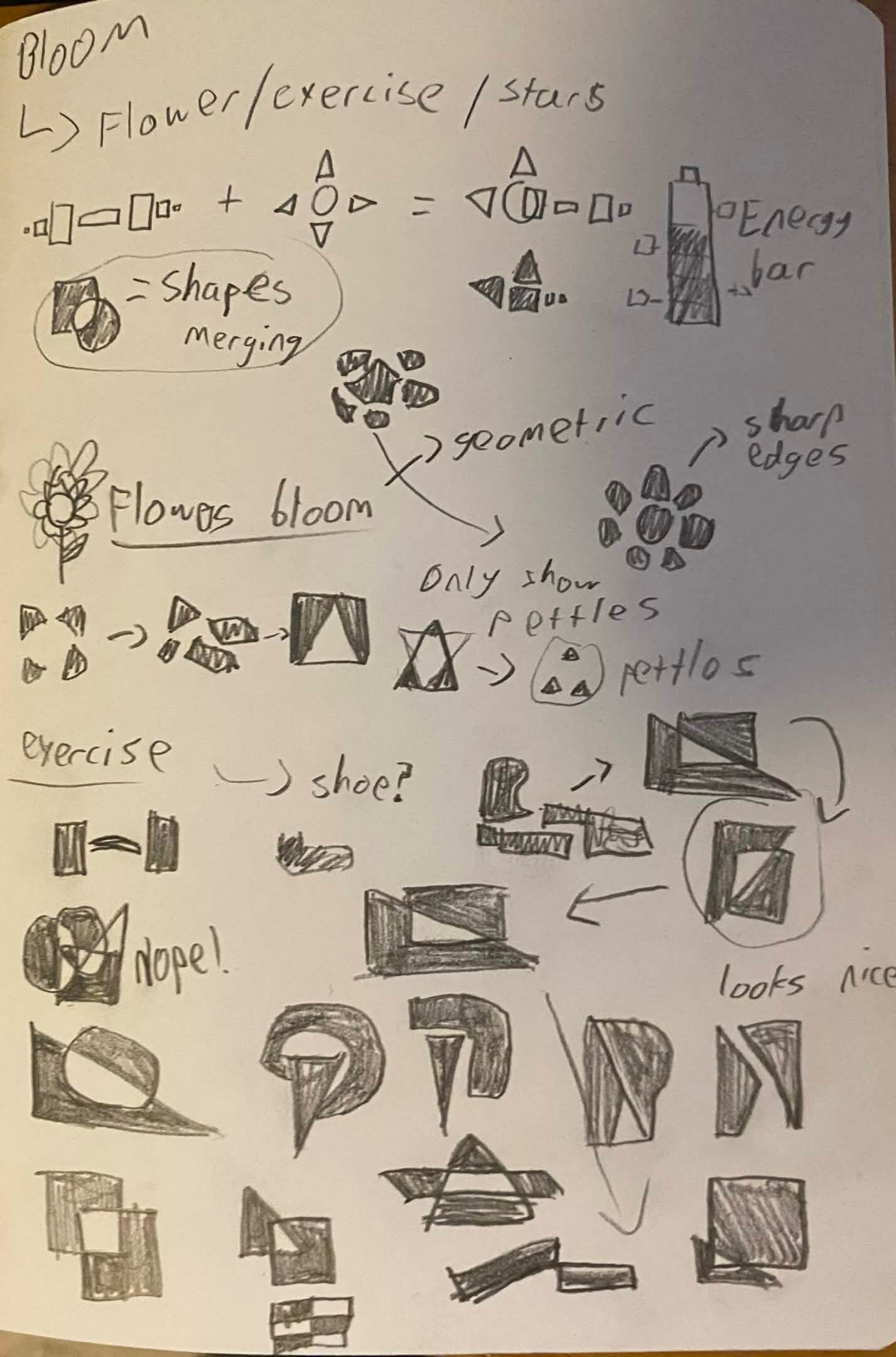
LOGO PRODUCTION
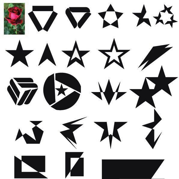
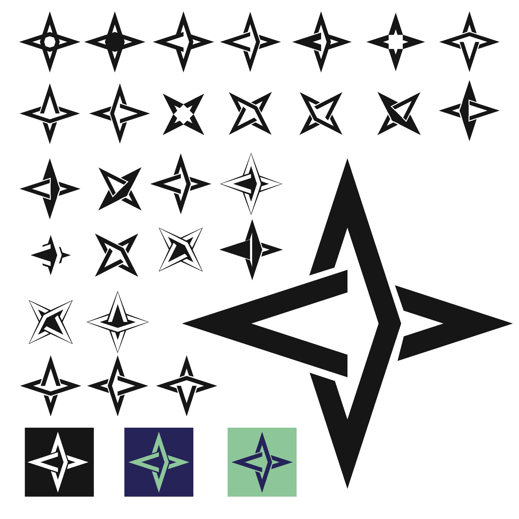
– A star represents expansion, linking to the expansion of your skills.
– A star also represents rebirth, brightness and blooming.
– The 4 side star is made out of 2 compass point shapes. This represents metaphorically pointing you in the right direction like a compass does.
– If you look closely the logo can become 2 different square plates overlapping. This represents the app being secure as there is protection around you – the square in the middle.
POSTERS
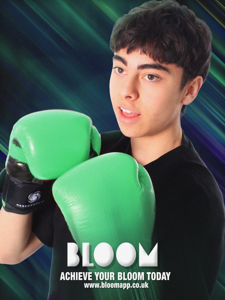
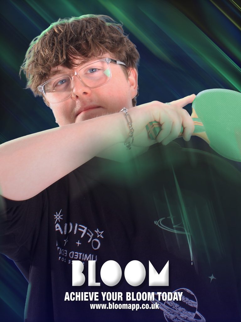
Both of these posters came out professional and clean, the backgrounds are eye-catching and full of motion plus bringing in the bloom colour scheme with bits of purple and yellow. The photos in the background fit nicely in the aspect ration and take up just the right amount of space to fill the poster but not completely cover the background. The blur effect of the pads and racket is very unique and it boosts the image more as it shows motion in the subjects objects as if they are moving them incredibly fast. The text is placed in the rule of thirds composition and layered with hierarchy with the most important sections at the top and the least at the bottom.
BLOOMSOCIAL MEDIA POSTS

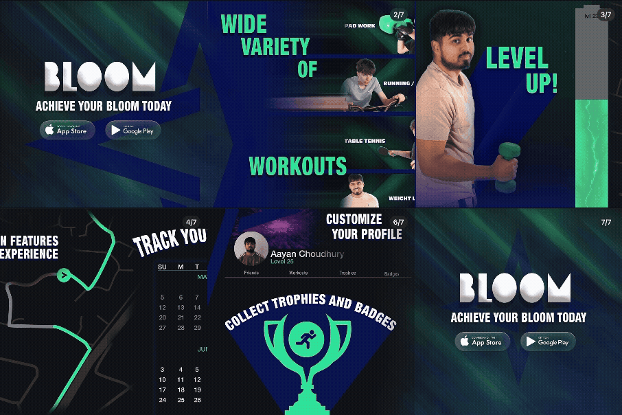
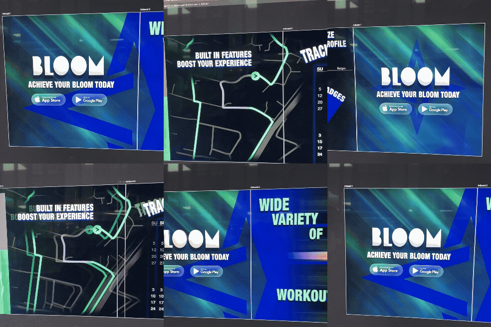
I produced 7 social media posts each demonstrating the key benefits, convincing the viewer to give the app a try. Each page demonstrates what you can do in the app and how it helps you workout successfully.I really like how i used the “carousel” technique to make all of the posts link together and when you scroll through the posts it makes the user feel like there scrolling through long one image.
The 2 things that i do not like are:
Because of the carousel theme i was not able to make the social media posts animated which i think is a really strong social media post to have as it brings in the views attention better.
Also I forgot to add a post about the shop, which is a key benefit about the app.
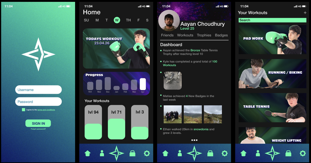
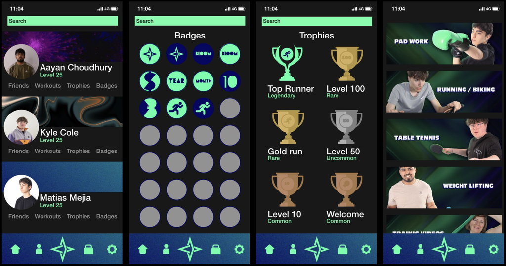
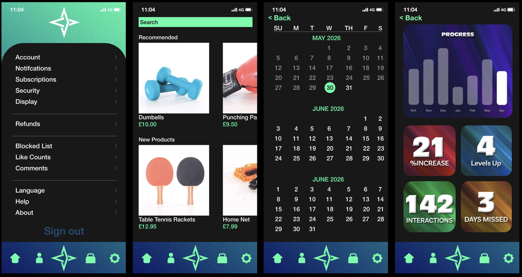
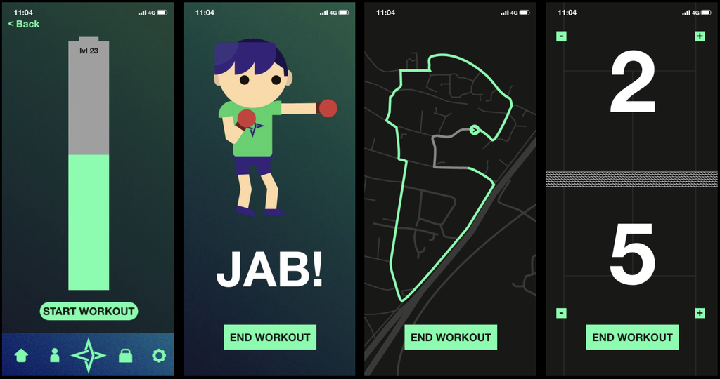
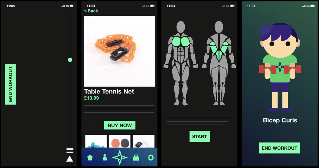
WIREFRAMES & APP DESIGN
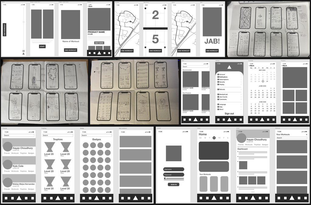
APP DESIGN – ADOBE XD